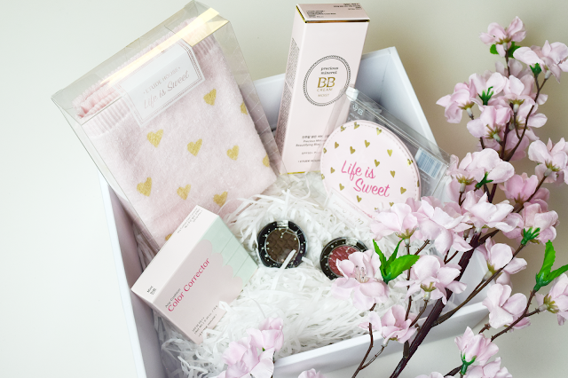
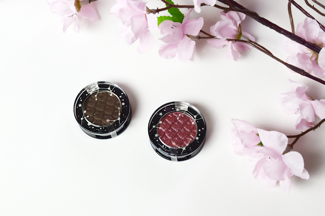
Etude House Look At My Eyes Sparkling Milky Way - BR429 & RD304
Etude House Life is Sweet Handtowel
Etude House Life is Sweet Hand Mirror
It's only sensible to start from the top of the list and work your way down! First up we have the Precious Mineral BB Cream Moist in Vanilla. If you're familiar with Korean BB Creams you will have heard this name before as it's a very popular one. However, they decided to make some changes to not only the packaging, but the formula and the colour shades available as well.
Vanilla and Petal are pink based, Beige is yellow based & Sand and Tan are neutral based. I picked Vanilla as it was the lightest shade and I stupidly misread that it was yellow based. I have very pale skin with yellow undertones, but the beige looked like it would be a bit too dark for my skin. I had already used Petal for another product in the range as a sample and found it washed me out too much. Vanilla, upon slightly closer inspection seems to be pink based in a way of brightening the skin (and it does still look fairly yellow toned as well). This is because when I'm wearing it I find my skin looks bright and not washed out at all.
I think due to me being so pale this looks very yellow to me and I did a thick swatch to fully show the colour pigment. Due to the pigmentation and the formula, this BB Cream is of a medium/heavy coverage, which is something I have been needing as I find a lot of mine are quite light.
I initially wore this in conjunction with the color correcting cushion we received. I did find it did look a bit heavy together but I think due to it being winter I don't notice if I look too pale or not. I did however, try it without the color corrector and instead used the Face Blur base from Etude House too and found it felt a lot lighter on my skin but it didn't compromise the product. The coverage was still medium/heavy but definitely not as heavy as before. I can understand why the coverage of the two combined is so strong because they are being advertised as the perfect combination for flawless skin.
The packaging releases the product in way of a typical squeezy tube. While I do like pumps, I find these to be easier to keep clean after wards and the tube is so slimline and sleek too!
I've been more than happy with this product. I find the BB Cream lasts all day even when I am running about at work and working with hot grills (I work with food!) and even 10 hours into the day my skin still looks bright. This was something I was needing as I found by the end of the day my skin looked incredibly dull and I looked like I barely had any make up on in the first place. My only problem with it, is because I have some larger pores along with some bad acne scars, I do find the product will sometimes sit in the pores, sometimes when I apply it it's fine, other times it's quite noticeable up close. This is just my skin type however and I feel if I find another method of application (perhaps using a sponge) I may find it doesn't do this as often.
I apologise for the following image as I'm not confident posting my face from the front angle (I have asymmetries everywhere). But on the right you can see the product on in combination with the color correcting cushion, while on the left you will see my skin with only the cushion on. As you can see the coverage is great and I'm really impressed with it,
Speak of the devil, next up is the Any Cushion Color Corrector in Mint. You would be forgiven for thinking that I picked this due to mint being my favourite colour. However, you're slightly wrong! We were given the choice of three different colours: Pink, Mint or Lavender (there is also a Strobe "shade" but these weren't offered to us as they are more for highlighting than correcting actual color issues).
If you click the image you can see some more information on the benefit of each shade (If I manually resize it for here it goes SUPER pixelated and it doesn't look nice. It took me a good while to make this as well T_T). My skin is pale but I find I often get red patches around my nose and any acne that decides to rear it's ugly head. I also find during the day at work my face tends to look quite red by the end of it. So this seemed the most ideal for me.
The packaging is the same as their other cushions but reminds me slightly more of a macaron with the pastel colours. It comes with a mirror, the standard Etude House cushion puff and you are also able to pop out the cushion to replace it when you are finished (which saves money in the long run as it's cheaper to buy a refill than a whole case + product again).
The cushion is a gorgeous pale minty green.
However when you take the product out from the cushion it's a much paler green.
So as you can see my face is brightened on the left side with some amount of the redness reduced however the coverage is very light so it may not do great for those with really really bad patches of red. I find this prevents my face from looking red throughout the day which happens to me with other products. It helps keep my skin looking refreshed all day. I would have preferred a slightly heavier coverage but I think because of that I will try their new 101 Color Contour Duo sticks for any time I find redness in my skin is a lot worse (for instance, when I have a cold, my nose goes horribly red or if I have for any reason had a wee cry).
I do like this product and I love the convenience of the cushion case so this is a product I will probably continue to by refills for while trying the 101 Sticks as well for areas that requite it more.
Left BR429 Tough Girl Capricorn ♡ Right: RD304 Pure Virgo (Jewel Range)
(Accidentally made this look kinda like Neapolitan ice cream...)
(Accidentally made this look kinda like Neapolitan ice cream...)
Here's just a super simple look I created applying Virgo all over the eyelid and then adding the brown to my outer corners. Finished off with liquid eyeliner and mascara! An extra note is that the packaging is adorable! The constellation on the top actually glows in the dark as well which is a really awesome feature to it.
Here's a graphic from Etude to showcase all the colours! What do you think of the colour chosen for your star sign? Do you find it fitting?
We received this gorgeous little handtowel and it's so cute that I actually don't want to use it! It's a pastel baby pink with gold hearts and writing with their brand slogan "Life is Sweet". I think I may keep this as a memento for this experience of being able to work with Etude House as I don't want to ruin it!

Kirsty ♡ Beige, Lavender, OR206 (Aries) & BK804 (Libra)
Mindy ♡ Beige, Pink, RD304 (Virgo) & BR428 (Cancer)
Sophie ♡ Petal, Mint, BL606 (Scorpio) & BR416 (Taurus)
Kathy ♡ Vanilla, Mint, BR428 (Cancer) & BL606 (Scorpio)
 These products were sent to me for review by Etude House in conjunction with their Pink Bird programme but all opinions on the products are 100% my own.


Post a Comment